决策树是一种流行的有监督学习方法。决策树的优势在于其既可以用于 回归,也可以用于分类,不需要特征缩放,而且具有比较好的可解释性, 容易将决策树可视化。可视化的决策树不仅是理解你的模型的好办法, 也是向其他人介绍你的模型的运作机制的有利工具。因此掌握决策树 可视化的方法对于数据分析工作者来说非常重要。
在这个教程里,我们将学习以下内容:
- 如何使用scikit-learn训练一个决策树模型
- 如何使用Matplotlib将决策树可视化
- 如何使用Graphviz将决策树可视化
- 如何将随机森林或决策树包中的单个决策树可视化
教程的代码可以从这里下载。 现在让我们开始吧。
1、用scikit-learn训练决策树模型
为了可视化决策树,我们首先需要用scikit-learn训练出一个决策树模型。
首先导入必要的Python库:
1 2 3 4 5 6 7 8 9 |
import matplotlib.pyplot as plt from sklearn.datasets import load_iris from sklearn.datasets import load_breast_cancer from sklearn.tree import DecisionTreeClassifier from sklearn.ensemble import RandomForestClassifier from sklearn.model_selection import train_test_split import pandas as pd import numpy as np from sklearn import tree |
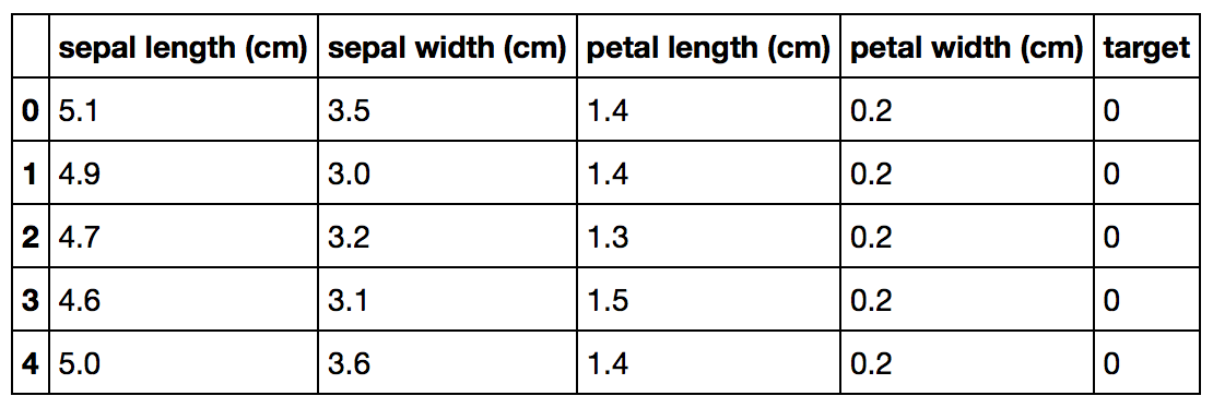
然后载入iris数据集。scikit-learn内置了Iris数据集,因此我们不需要 从其他网站下载了。下面的Python代码载入Iris数据集:
1 2 3 4 |
import pandas as pd from sklearn.datasets import load_irisdata = load_iris() df = pd.DataFrame(data.data, columns=data.feature_names) df['target'] = data.target |
Iris数据集看起来是这样:
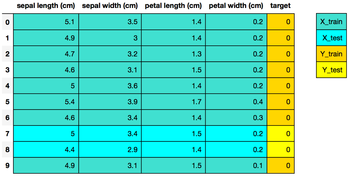
接下来我们将Iris数据集拆分为训练集和测试集:
1
|
X_train, X_test, Y_train, Y_test = train_test_split(df[data.feature_names], df['target'], random_state=0)
|
分割后的Iris数据集看起来是这样:

最后,我们采用scikit-learn经典的4步模式训练决策树模型:
1 2 3 4 5 6 7 8 9 10 11 |
# Step 1: Import the model you want to use # This was already imported earlier in the notebook so commenting out #from sklearn.tree import DecisionTreeClassifier # Step 2: Make an instance of the Model clf = DecisionTreeClassifier(max_depth = 2, random_state = 0) # Step 3: Train the model on the data clf.fit(X_train, Y_train) # Step 4: Predict labels of unseen (test) data # Not doing this step in the tutorial # clf.predict(X_test) |
2、使用Matplotlib将决策树可视化
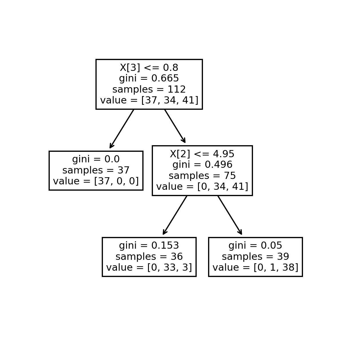
从scikit-learn 版本21.0开始,可以使用scikit-learn的tree.plot_tree 方法来利用matplotlib将决策树可视化,而不再需要依赖于难以安装的dot库。 下面的Python代码展示了如何使用scikit-learn将决策树可视化:
1
|
tree.plot_tree(clf);
|
决策树可视化结果如下:

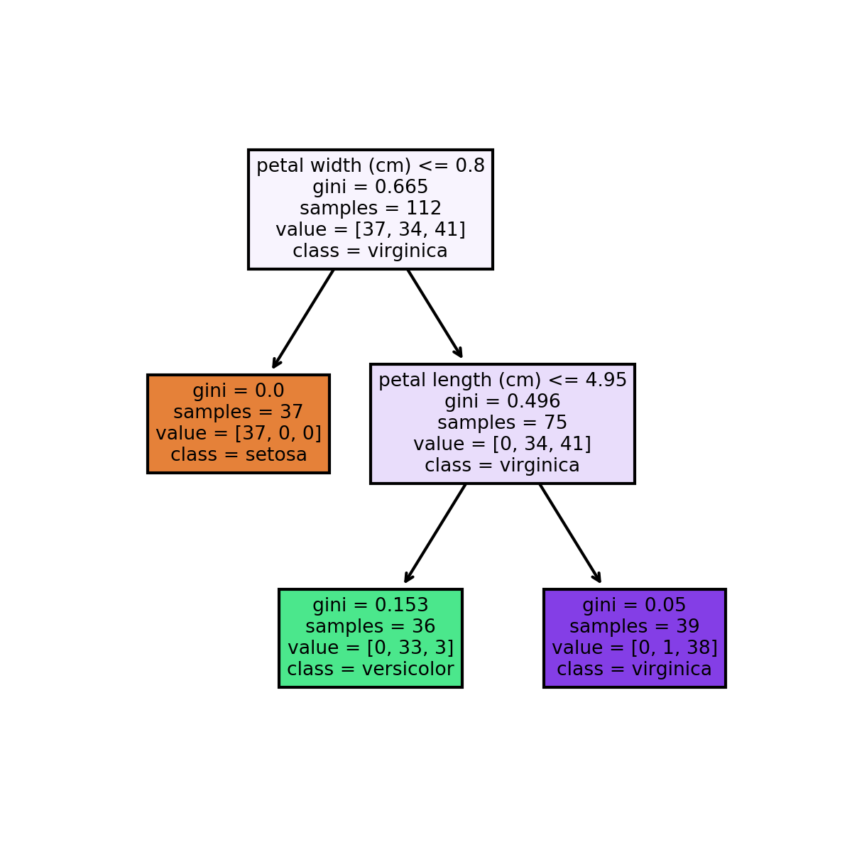
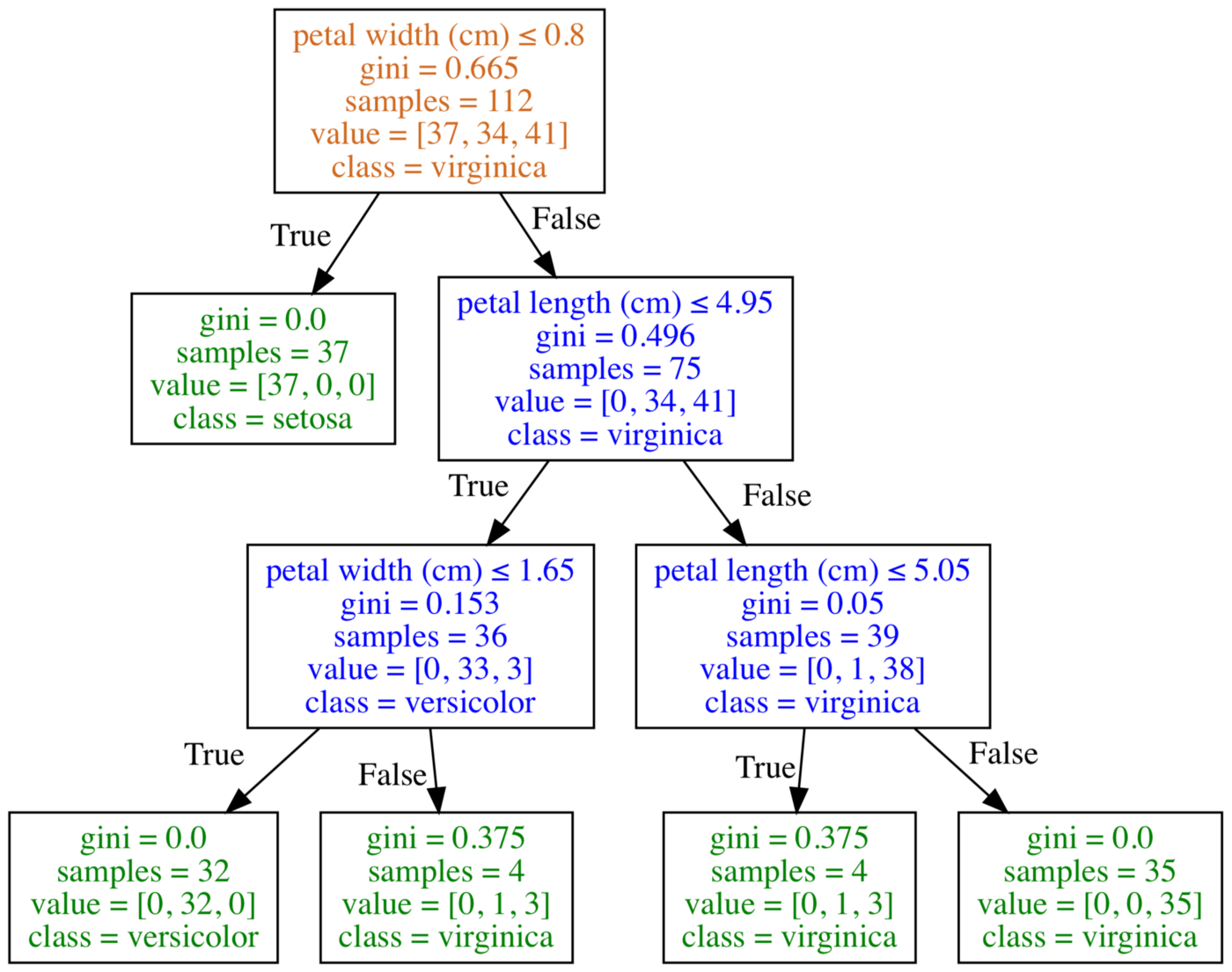
还可以添加一些额外的Python代码以便让绘制出的决策树具有更好的 可解读性,例如添加特征和分类名称:
1 2 3 4 5 6 7 8 |
fn=['sepal length (cm)','sepal width (cm)','petal length (cm)','petal width (cm)'] cn=['setosa', 'versicolor', 'virginica'] fig, axes = plt.subplots(nrows = 1,ncols = 1,figsize = (4,4), dpi=300) tree.plot_tree(clf, feature_names = fn, class_names=cn, filled = True); fig.savefig('imagename.png') |
增加了更多信息的决策树可视化结果如下:

3、使用Graphviz将决策树可视化
下图是使用Graphviz得到的决策树可视化结果:

Graphviz是一个开源的图(Graph)可视化软件,采用抽象的图和网络 来表示结构化的信息。在数据科学领域,Graphviz的一个用途就是实现 决策树可视化。我将graphviz方法放在matplotlib方法之后,是因为 这个软件用起来有点复杂。
为了将决策树可视化,首先需要创建一个dot文件来描述决策树,这个倒 不难。问题在于使用Graphviz将dot文件转换为图形文件,例如png、jpg等等 可能会有点难度。
有一些办法来降低graphviz的使用门槛,例如通过Anaconda安装python-graphviz、 利用mac的homebrew安装grahpviz、利用官方提供的windows安装文件、或者使用 在线转换器将决策树的dot文件转换为图形:
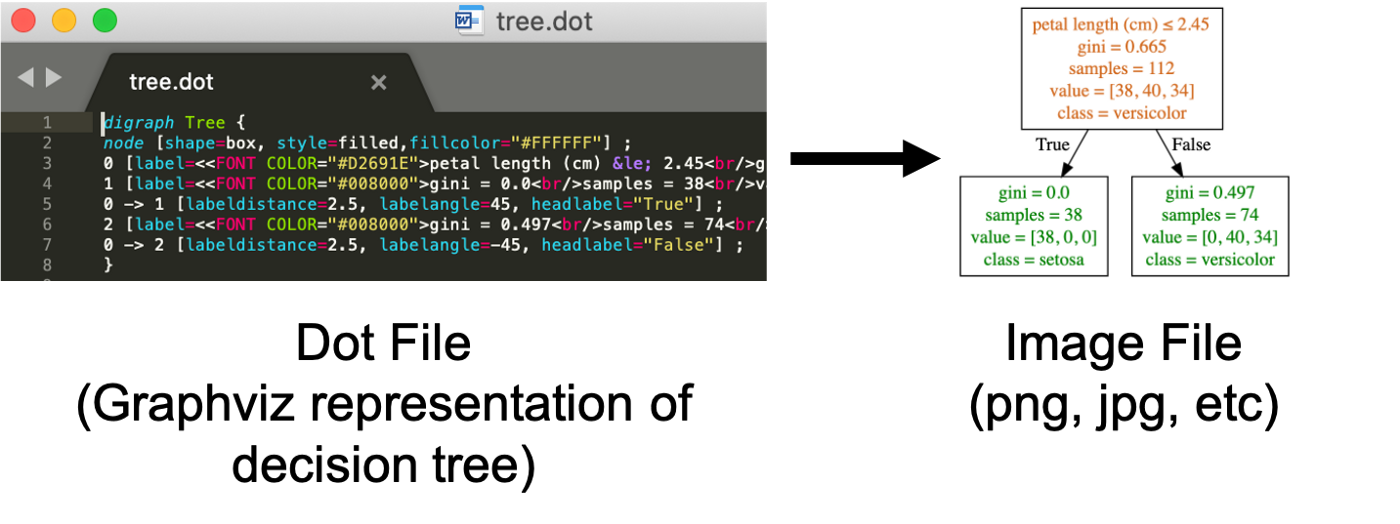

首先我们将决策树模型导出为dot文件:
1 2 3 4 5 |
tree.export_graphviz(clf, out_file="tree.dot", feature_names = fn, class_names=cn, filled = True) |
然后我们用conda安装graphviz:
1
|
conda install python-graphviz
|
现在就可以将决策树模型导出的dot文件转换为图形文件了:
1
|
dot -Tpng tree.dot -o tree.png
|
4、将决策树包或随机森林里的单个决策树可视化
决策树的一个缺点是通常其预测精度不够好。这部分原因在于其 变化幅度比较大,对训练数据的不同拆分方式可能会生成截然不同 的决策树模型。
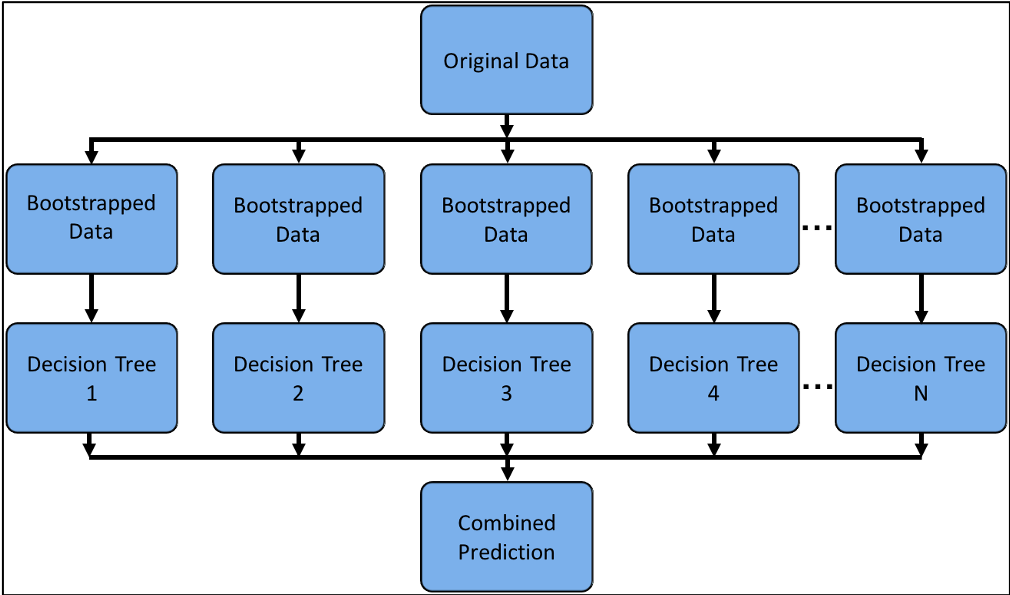

上图可以表示决策树包或者随机森林模型之类的组合学习方法, 通过将多个机器学习算法组合起来以期获得更好的预测性能。 在这一部分,我们学习如何将这些组合模型中的单个决策树可视化。
首先还是使用scikit-learn来训练得到一个随机森林模型:
1 2 3 4 5 6 7 8 9 10 11 12 13 |
# Load the Breast Cancer (Diagnostic) Dataset data = load_breast_cancer() df = pd.DataFrame(data.data, columns=data.feature_names) df['target'] = data.target # Arrange Data into Features Matrix and Target Vector X = df.loc[:, df.columns != 'target'] y = df.loc[:, 'target'].values # Split the data into training and testing sets X_train, X_test, Y_train, Y_test = train_test_split(X, y, random_state=0) # Random Forests in `scikit-learn` (with N = 100) rf = RandomForestClassifier(n_estimators=100, random_state=0) rf.fit(X_train, Y_train) |
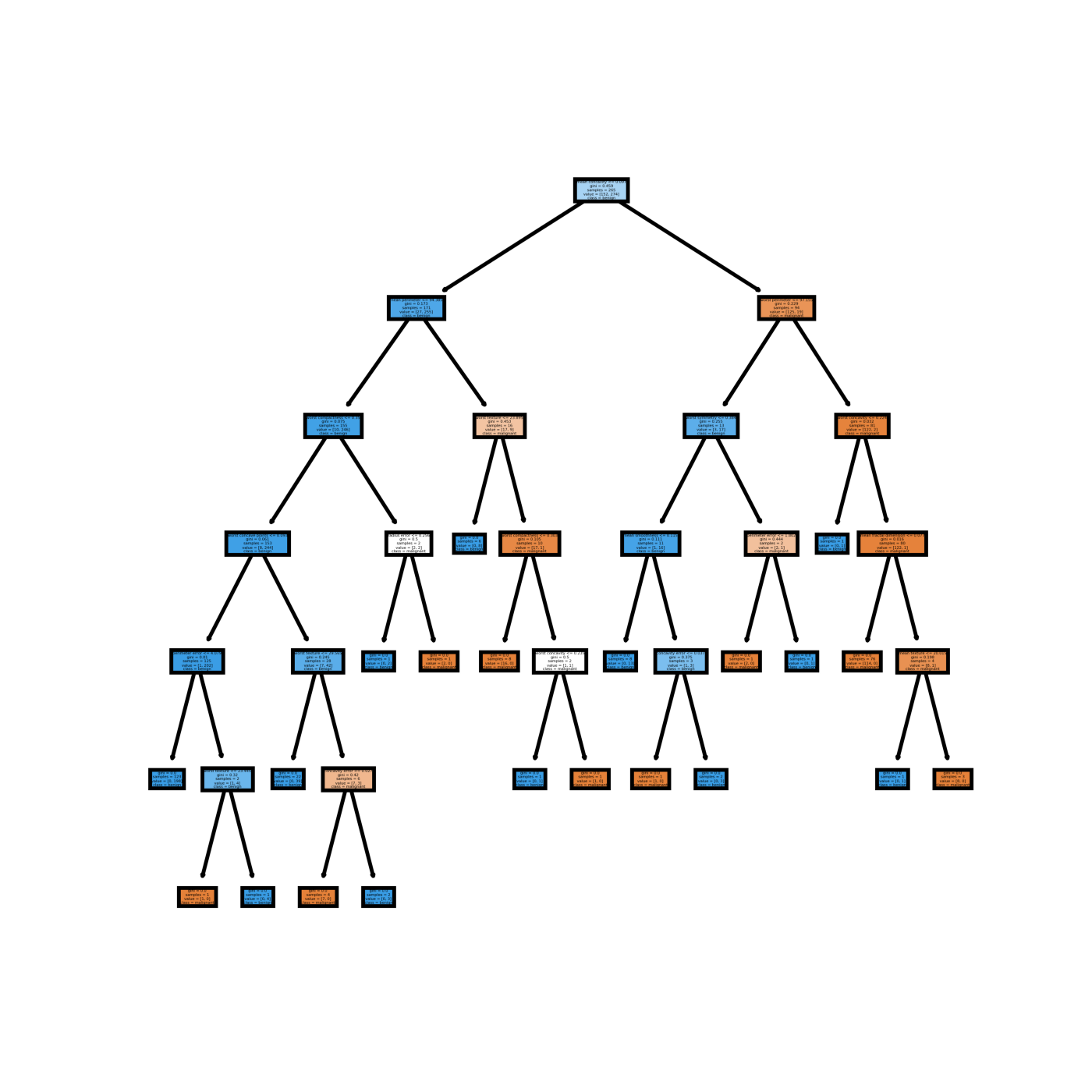
现在我们可以将模型中的单个决策树可视化。首先还是使用matplotlib。 下面的python代码将第1个决策树可视化:
1 2 3 4 5 6 7 8 |
fn=data.feature_names cn=data.target_names fig, axes = plt.subplots(nrows = 1,ncols = 1,figsize = (4,4), dpi=800) tree.plot_tree(rf.estimators_[0], feature_names = fn, class_names=cn, filled = True); fig.savefig('rf_individualtree.png') |
得到的这个决策树可视化结果如下:

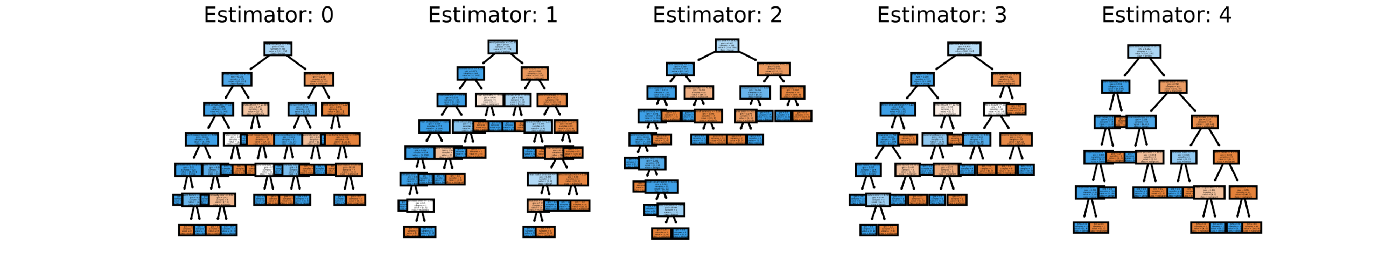
你可以试着使用matplotlib的subplot来将你期望的多个决策树可视化。 例如下面的Python代码将组合模型中的前5个决策树可视化:
1 2 3 4 5 6 7 8 9 10 |
# This may not the best way to view each estimator as it is smallfn=data.feature_names cn=data.target_names fig, axes = plt.subplots(nrows = 1,ncols = 5,figsize = (10,2), dpi=3000)for index in range(0, 5): tree.plot_tree(rf.estimators_[index], feature_names = fn, class_names=cn, filled = True, ax = axes[index]); axes[index].set_title('Estimator: ' + str(index), fontsize = 11)fig.savefig('rf_5trees.png') |
不过我个人不喜欢这么做,因为这看起来太费眼睛了:

5、教程小结
在这个教程里,我们学习了如何使用matplotlib和graphviz将scikit-learn 训练得到的决策树可视化,也学习了如何将组合模型中的一个或多个决策树 可视化,希望这有助于你的数据分析工作。
原文链接:Visualizing Decision Trees with Python
本文来自汇智网,观点不代表一起大数据-技术文章心得立场,如若转载,请注明出处:http://blog.hubwiz.com/2020/04/04/decision-tree-visualization-python/
注意:本文归作者所有,未经作者允许,不得转载